Brand Identity
VS Beauty Center
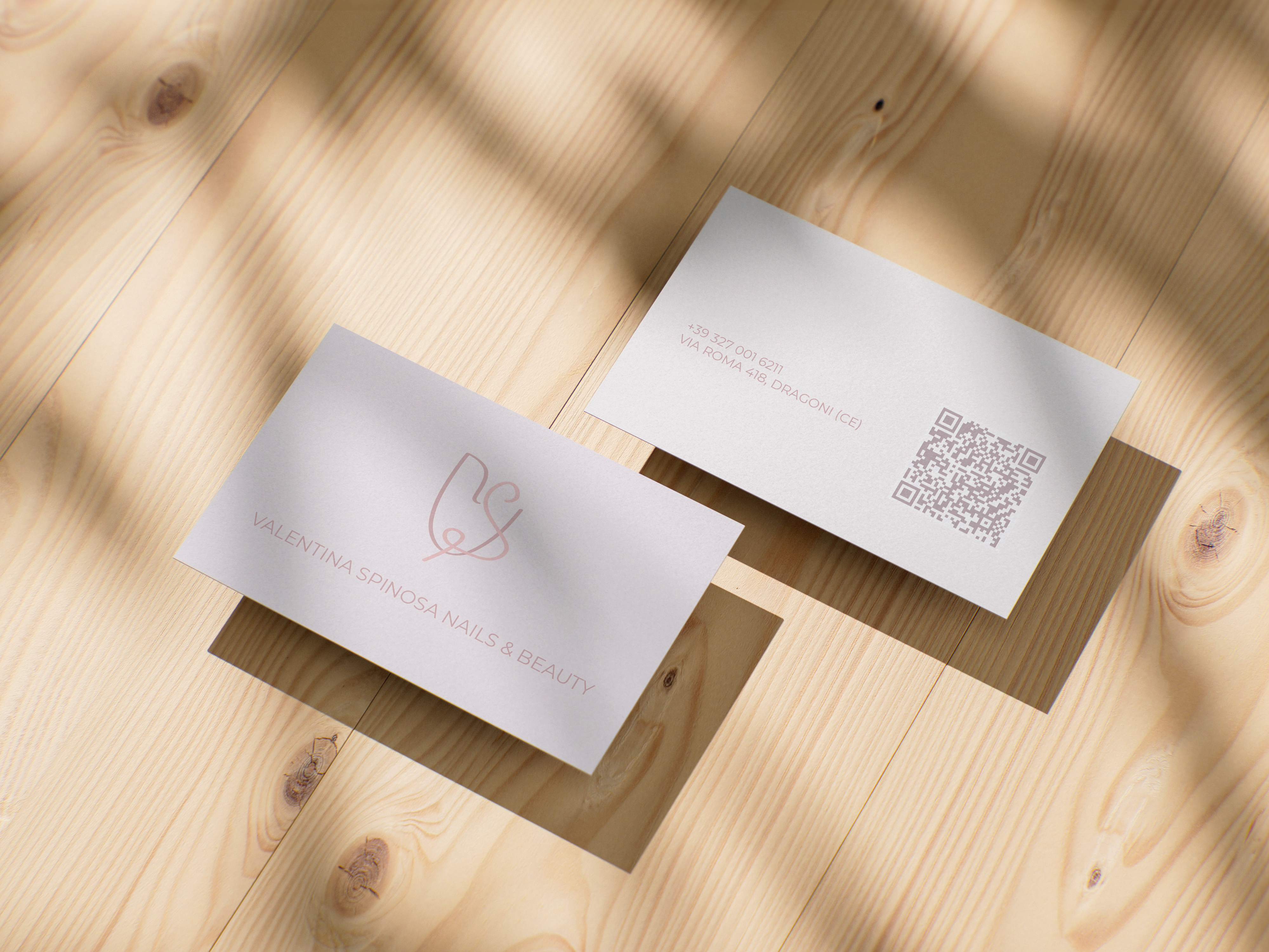
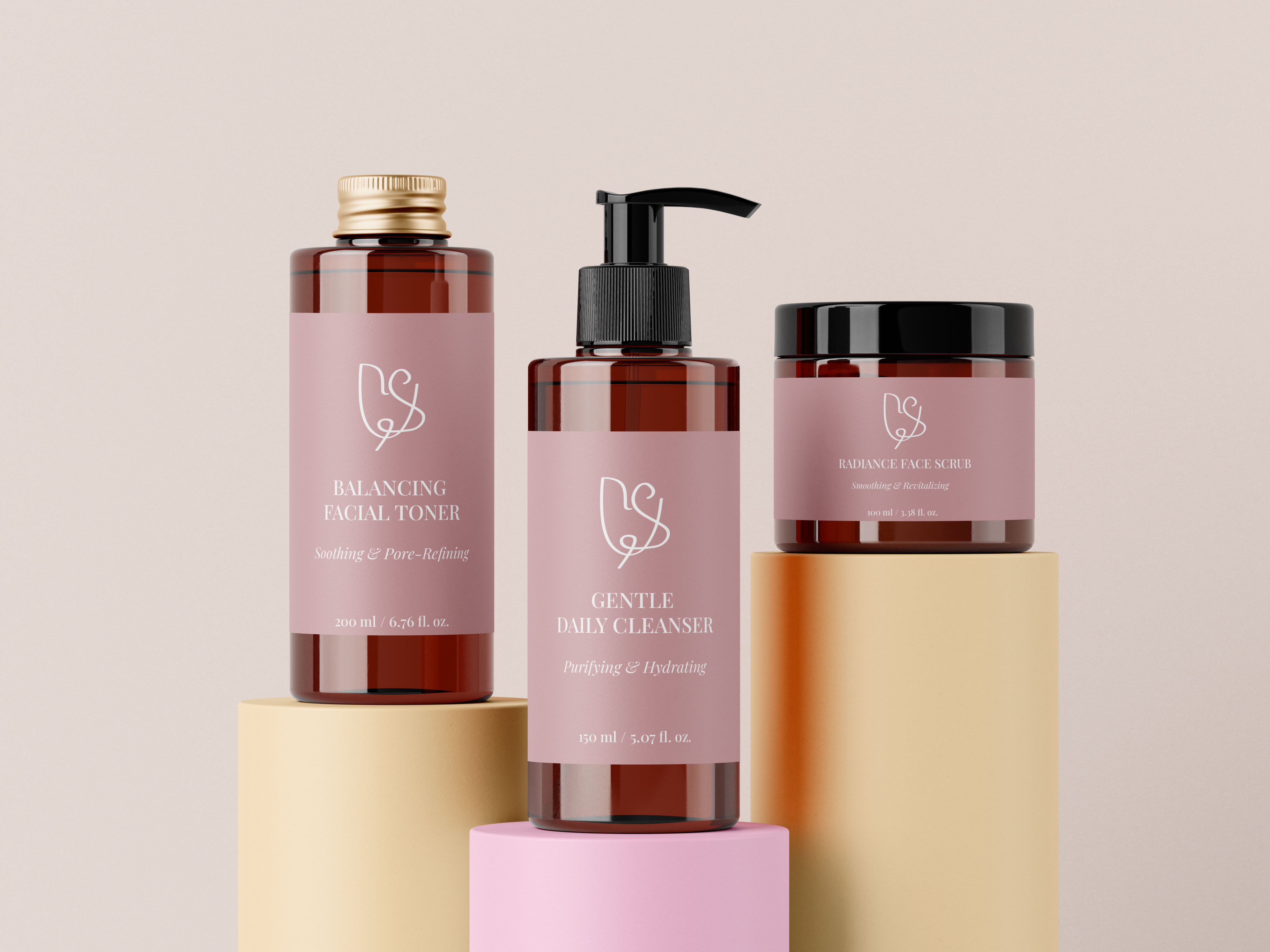
A brand identity designed for Valentina Spinosa, a beauty salon offering a range of beauty and personal care services. The visual identity was created to communicate a feminine, elegant and welcoming atmosphere.


The logo combines the initials V and S, taken from the owner’s name, into a single fluid symbol that subtly recalls the shape of a tulip. This creates a distinctive mark with a personal meaning, while maintaining a soft and elegant appearance.
The identity is built around a delicate palette paired with Montserrat and Playfair Display. The combination of soft pink tones and contrasting typefaces creates a balance between modern simplicity and timeless elegance.
Logo



01 / 04
Color Palette
Typography
Montserrat
Aa Bb Cc
Playfair Display
Aa Bb Cc